Brand Identity
Jotted
A scribble made deliberate — the energy of a thought caught mid-flight.
Overview
- Discipline
- Brand Identity
- Role
- Design & production
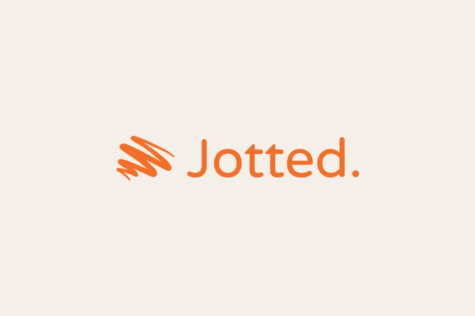
Jotted is a notebook and stationery brand, and its logotype had to feel like the thing it sells: the moment a thought gets written down. It holds two gestures in one breath — a loose, spiralling mark that reads as handwriting in motion, and a clean rounded wordmark that grounds it. The terminal period turns a fleeting note into something kept.
For a stationery brand, the mark earns its place by being about the act of writing rather than the product. The symbol is unfinished by design — a cascade of looping strokes that catch a thought before it settles — while the wordmark stays composed and assured. Together they run the whole arc of an idea, from impulse to record, which is exactly what a notebook is for.
The Mark
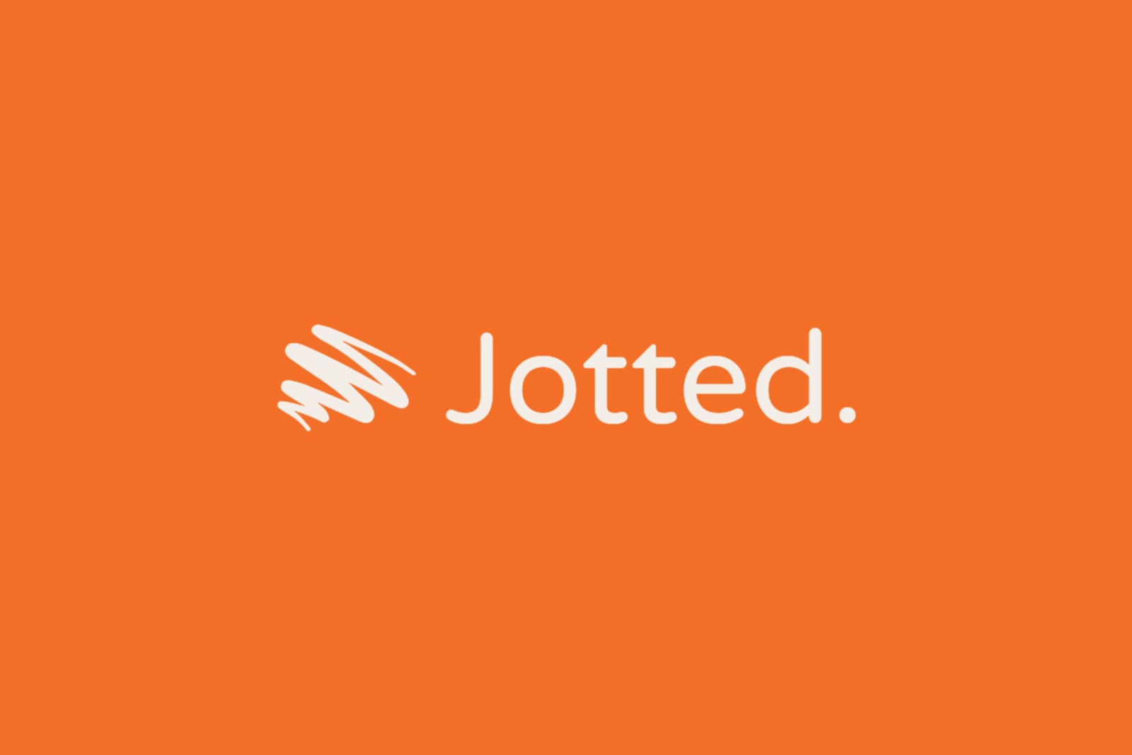
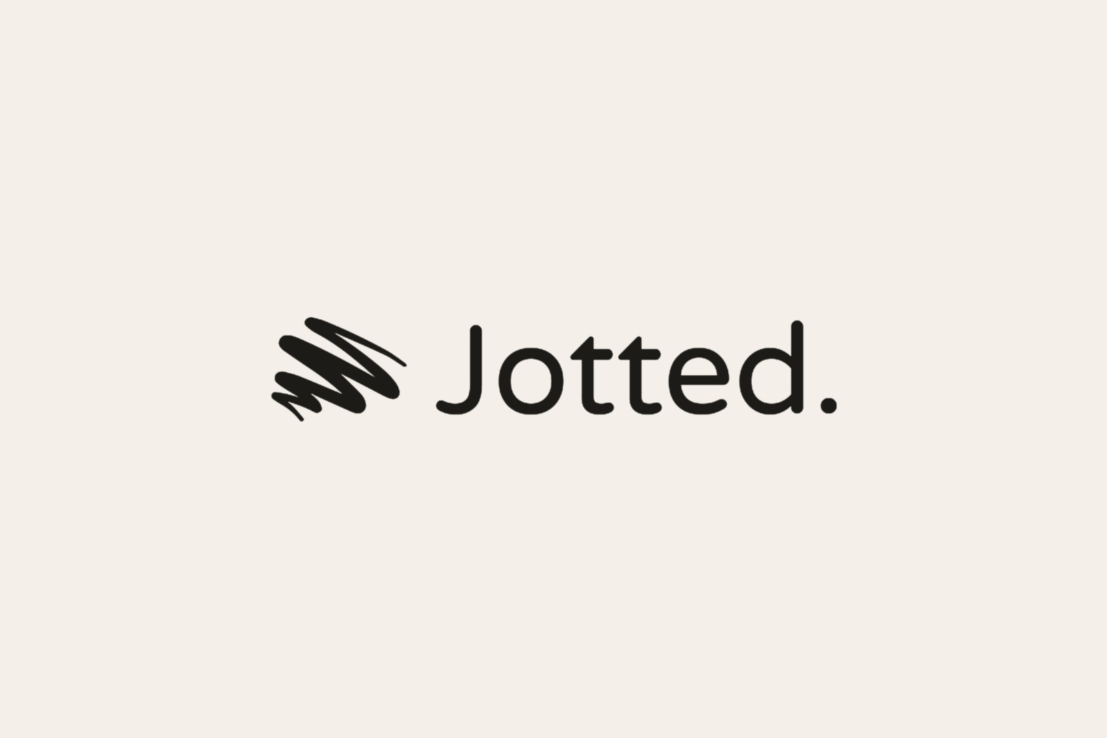
The symbol is a cluster of overlapping scribble-strokes in a single warm orange — not a tidy icon of a pen, but the trace the pen leaves. The looseness is deliberate; every loop slightly overruns the last, the way handwriting does when the mind moves faster than the hand.
The wordmark is set in a humanist rounded sans — soft terminals, open apertures, letterspacing generous enough to let the word breathe. The colour is identical to the symbol, unifying mark and name without a container or frame. The terminal period is the most considered choice here: it closes the word the way a period closes a sentence, and in a logotype reads as quiet emphasis — the designer’s signature on the idea.
Gallery
Outcome
A mark that captures the private moment of notation — confident, warm, and unmistakably its own.