Brand Identity
Cyberus Systems
Three layered forms in deep navy — a mark that reads as both signal and structure.
Overview
- Discipline
- Brand Identity
- Role
- Design & production
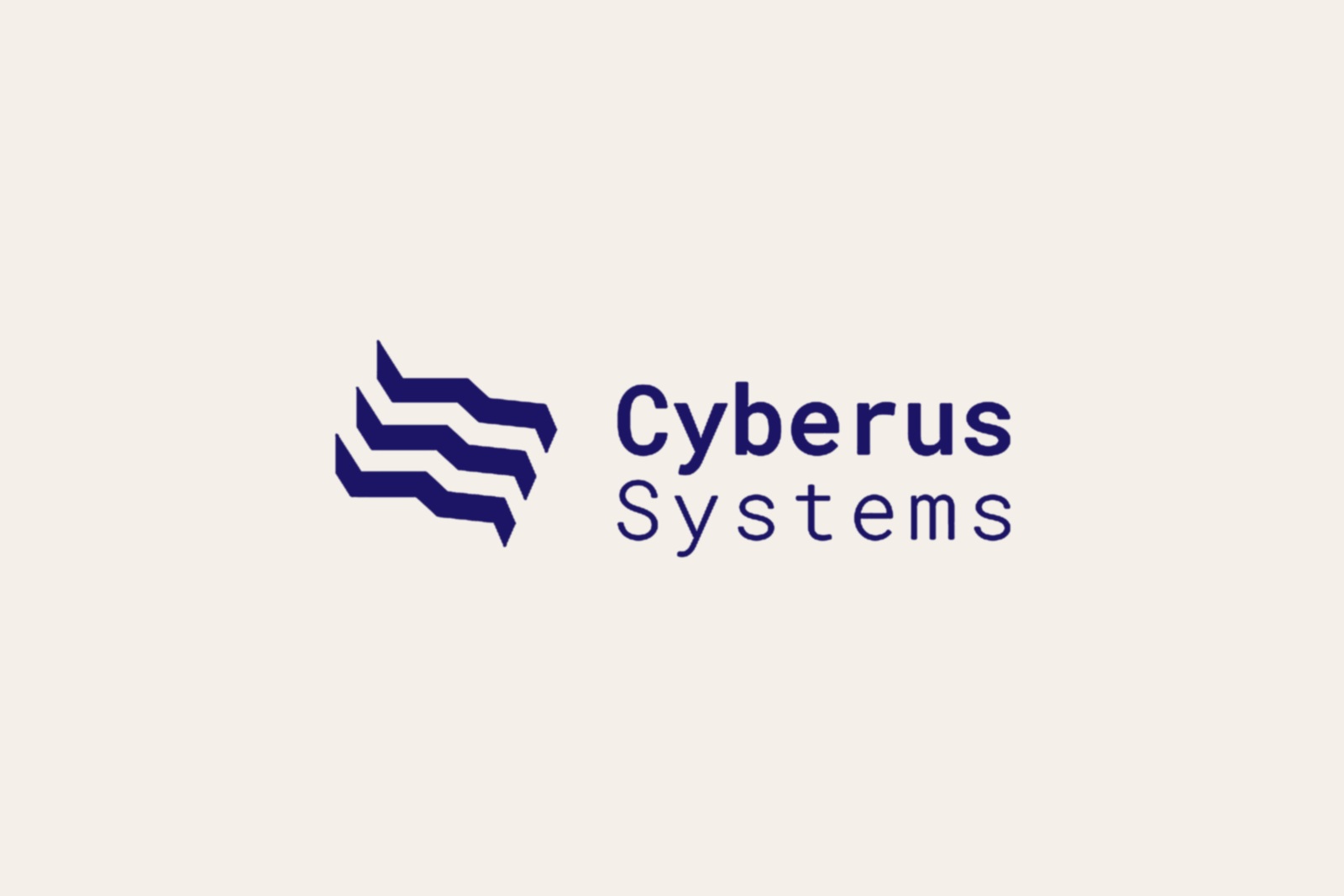
Cyberus Systems is a cyber-security company, and its identity had to hold two ideas at once — protection, and the constant movement of data. The mark answers with a stacked symbol of three chevron-like bands, each offset from the last, set against a clean geometric wordmark: the symbol does the expressive work, the type grounds it with institutional weight.
The name folds the digital (cyber) into the mythological guardian (Cerberus), and the form follows — the layered bands read at once as signal waves, network layers, or shields in motion. For a security brand, legibility is the point: the mark signals vigilance and technical depth without falling back on padlocks or the usual clichés.
The Mark
The symbol is three parallel chevron bands, each stair-stepped downward to the left, generating cascading movement that never breaks into chaos. The geometry is precise — equal weight, equal spacing — which keeps the dynamism disciplined. That tension between motion and order is the mark’s central idea.
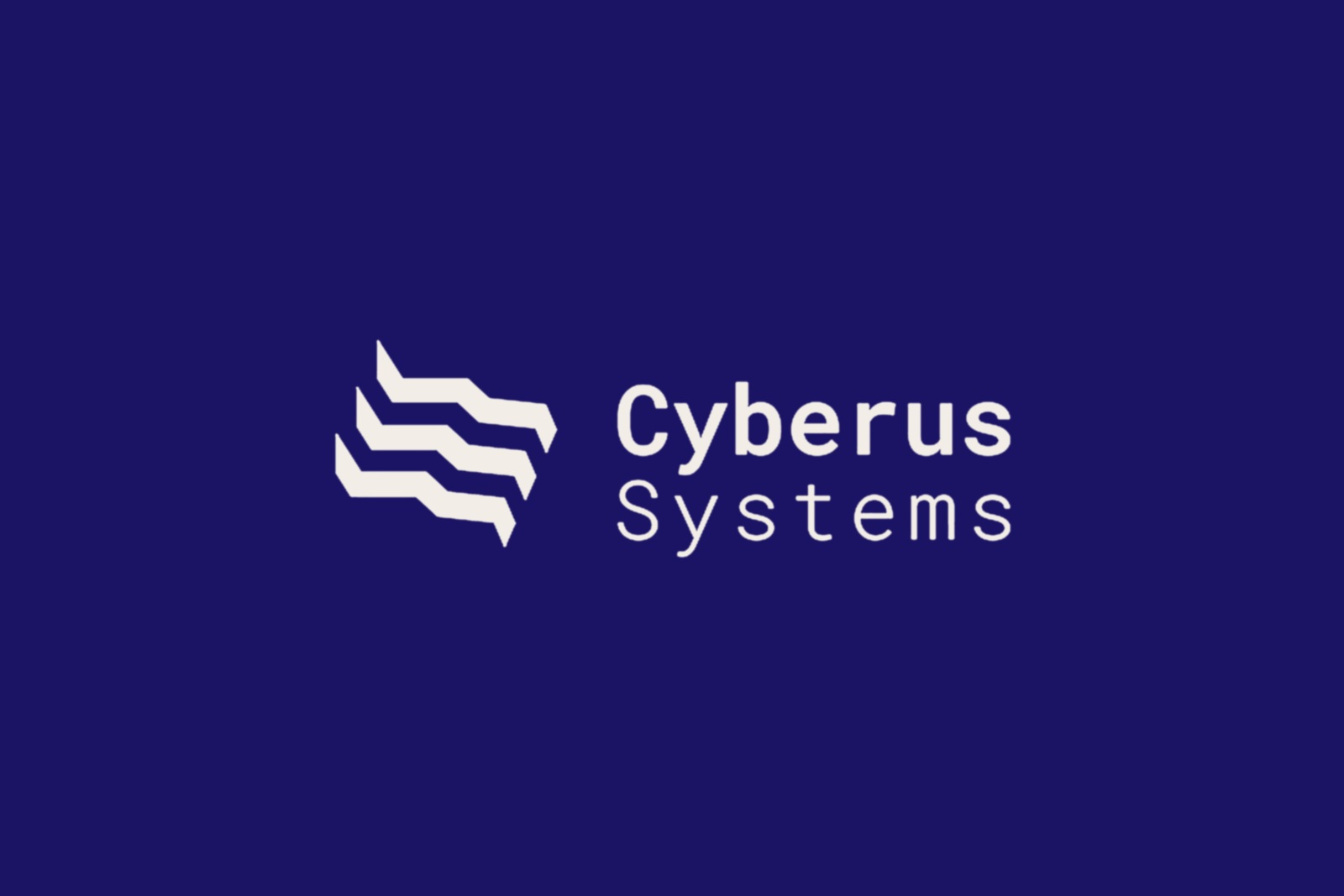
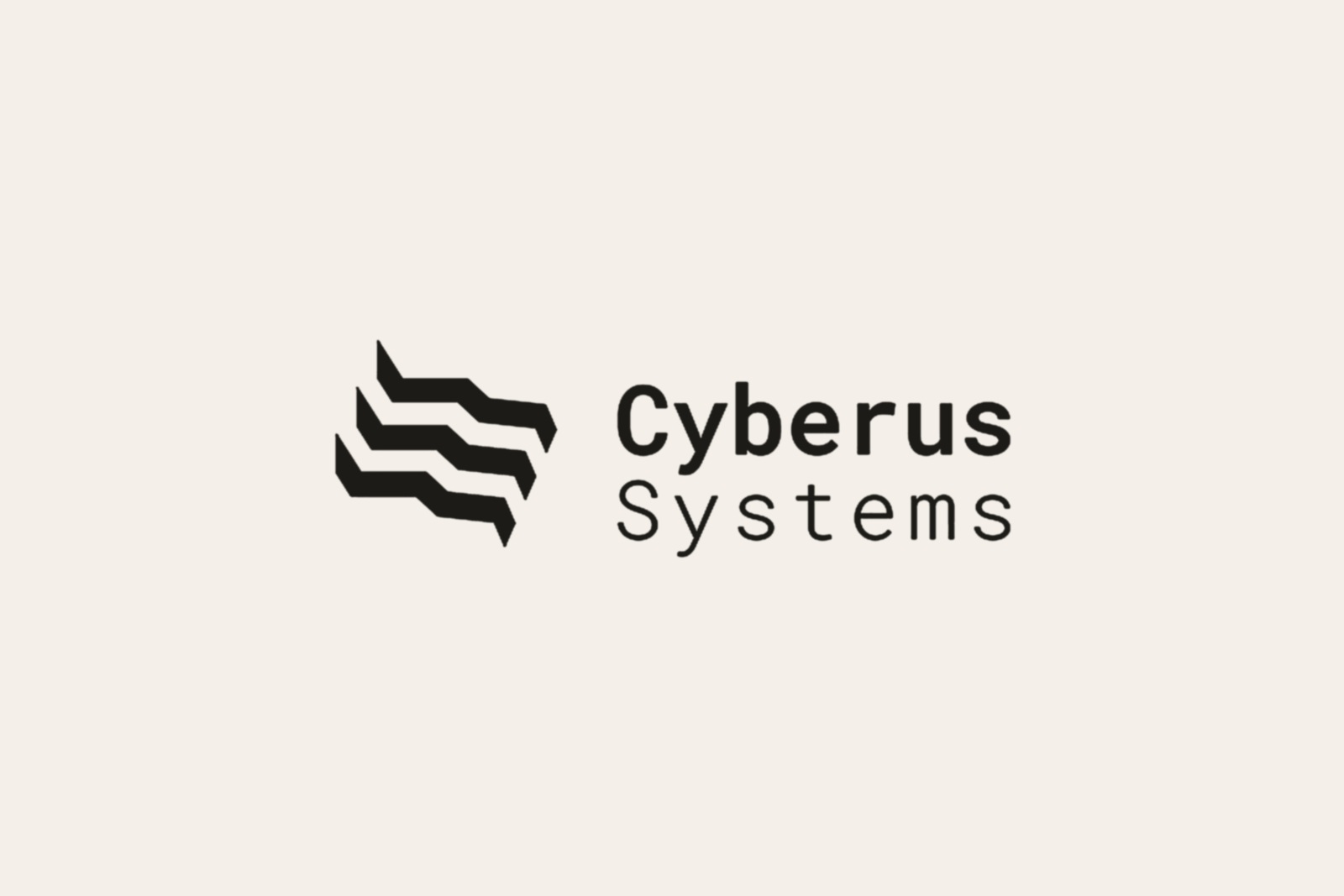
The wordmark is set in a round-cornered geometric sans that echoes the softened cuts in the symbol. Deep navy unifies both: authoritative without aggression, technical without coldness. “Systems” sits flush beneath “Cyberus” at a lighter optical weight — identity before descriptor — while the two-line stack mirrors the layered logic of the icon itself.
Gallery
Outcome
A mark restrained enough to anchor a wider identity — technically rigorous without losing its edge.